In response to an open call on Facebook, Shift Focus Without Warning submitted the following proposal to Zammit Projects for consideration as a part of the show "Proposal". The exhibition opens tonight at 6pm.
[gallery]
Friday, September 14, 2012
Friday, July 27, 2012
Install Playlist: David M. Thomas
 "Dust Me Selecta"[ref]Installing an exhibition is often an exercise that includes sweeping, cleaning, painting and long stretches of work with measuring tape and cordless drill. Housekeepers and tradespersons might choose to listen to music while they complete these tasks - artists are no different. As an irregularly updated feature, Shift Focus Without Warning presents Install Playlists: streaming music selections played by the artist at the time and location of the installation of a recent exhibition. Are there links between the songs and the show? Do these tracks offer clues pertaining to the artist's aims or influences? These playlists are presented without analysis for your consideration.[/ref]
[caption id="" align="alignnone" width="3819"]
 David M. Thomas, 2012, Clay Face[/caption]
David M. Thomas worked with Joseph Breikers and Stephen Russell in developing, building and installing A Party Disguised as Work or Work Disguised as a Party, which has been showing at Boxcopy since the 7th of July. During the laborious installation, which is documented in one of the many videos that are screened in the space, the three listened to a soundtrack of stoner and desert rock - while a precise playlist is not at this time available, what is known for certain is that it includes this 1993 track by the prolific Washington act Melvins.
On the evening of the 28th of July, at the close of the exhibition, there will be a live performance by the band Eggvein, beginning at 7pm.
A Party Disguised as Work or Work Disguised as a Party
New work by David M. Thomas
With Joseph Breikers and Stephen Russell
7 – 28 July 2012
[AWD_comments]
Wednesday, June 27, 2012
Install Playlist: Sean Barrett
"Dust Me Selecta"[ref]Installing an exhibition is often an exercise that includes sweeping, cleaning, painting and long stretches of work with measuring tape and cordless drill. Housekeepers and tradespersons might choose to listen to music while they complete these tasks - artists are no different. As an irregularly updated feature, Shift Focus Without Warning presents Install Playlists: streaming music selections played by the artist at the time and location of the installation of a recent exhibition. Are there links between the songs and the show? Do these tracks offer clues pertaining to the artist's aims or influences? These playlists are presented without analysis for your consideration.[/ref]


Sean Barrett contributes The Gathering to this year's Fresh Cut at the Institute of Modern Art. This is how he describes the installation process:
The installation for The Gathering is largely about the placement of the photographs on the floor, an intuitive process that takes into account how the body moves about the gallery space, how the works are visible from any one standpoint, and the relationships created in each grouping of the images. It usually takes a fair bit of fine tuning until I'm happy with the way the install presents.
Fresh Cut 2012
Sean Barrett, Antionette J. Citizen, Yavuz Erkan, David Nixon
Institute of Modern Art
23 June — 4 August
[AWD_comments]
Wednesday, June 20, 2012
Registration: Christopher Hanrahan, 'Museums Have The Same Problems as Unions' at Sarah Cottier Gallery
[caption id="" align="alignnone" width="506"] Frank Sabotka, portrayed by Chris Bauer in the HBO series The Wire[/caption]
Frequent and infrequent travellers - this writer would like you to consider your position to a simple question: should access to the internet be freely available in hotels that can provide it? It appears to be a topic of recent online press interest, with the debate focussing on marketplace adaptibility. Jennifer Walters[ref]http://www.nytimes.com/2009/05/10/travel/10pracwifi.html[/ref], publicist for the Thompson group of hotels, argues that
On the other hand, CNN Business Travel reporter Ayesha Durgaree argues that wifi access is not a specialised service, and that the 50 percent of upmarket hotels that continue to charge for this amenity are in need of reform:
The 'Hot Water' argument, as is has come to be known, is that while some guests use more or less or possibly even no hot water during their tenancy, no respectable hotel would control access and volume of hot water, rather, they would budget the overall hot water use into their overheads. For the Hot Water argument to ring true, access to the internet, or information, needs to be analogous to water and light - with the rate of technological development increasing consumer-end possibilities, wifi architecture is in need of constant review and upgrade, while correctly installed water and power systems can be relied on to operate with minimal maintenance for many, many years. In the past, hotels would generate a considerable amount of income from business travellers making international and other calls from their rooms - it is a different marketplace today of course, as most travellers have mobile devices and (perhaps more importantly) in the face of the GFC, expense accounts have dried up. Does charging for internet access make up for this lost revenue?
It is possible that the central issue is one of control, rather than economies. The uses of internet information range from the menial to the nefarious, outside of firewalls and filters, providers have very little control. While some hotel owners point to the costs of installing and maintaining wifi as preclusive to its offer as a free service, it is interesting to observe that many hotels charging a service fee for in-room internet access offer wifi free of charge in their lobby. In these instances, a guest can access the world wide web for free, if they choose to be publicly observable doing so. It is absurd to imagine free access to hot water and light only being offered in centralised, public locations - but after all, hot water is only for cleaning, and light is only for visibility, surely no other applications are imaginable...
On the walls of Sarah Cottier gallery, framing a collection of extraordinary sculptures, hang 21 photographs. With varying levels of contrast, they seem to capture the topographic view of table lamps, and are titled "21 hotel lamps/lights for PM". While the process of creating these simple images remains mysterious, it would seem that Hanrahan has re-monetised hotel electricity: using photography to capture and commodify the light provided, free of extra charge, to hotel guests.
[caption id="" align="alignnone" width="770"] #1 2011- 2012") Christopher Hanrahan Museums Have The Same Problems As Unions (21 hotel lamps/lights for PM) #1 2011- 2012[/caption]
Christopher Hanrahan Museums Have The Same Problems As Unions (21 hotel lamps/lights for PM) #1 2011- 2012[/caption]
While these images can be seen as an ideal crystallisation of the debates surrounding artist-tourism, more interesting to this writer is the idea that these photographs provoke perhaps the central 'problem' shared by museums and unions - what can be, or should be, done with 'shared power'? The title is easily the most thought-provoking of any show attended by this writer in the last twelve months. A lot can be learned about your own position in the economy by considering your first instinctual reading of the word 'Problems' - is the word to be understood as 'the known structural or moral flaws within the organization needed to be fixed in order to operate sustainably', or as 'the challenges and tasks happily and dutifully engaged with as a properly functioning group'?Another nimble metaphor for "shared power" sits on the floor of the space - a powerboard provides the electricity to the bare light bulbs hanging from steel - also hanging from these are silk banners bearing reproductions of an antiques catalogue supplemented with politicised discussions of the Australian union movement. The pages are abstracted from their source, provided with very little context outside of the exhibitions' title.
[caption id="" align="alignnone" width="938"] Christopher Hanrahan, Museums have the Same Problems as Unions, installation view[/caption]
The steel product , SHS (Square Hollow Section), is one that Hanrahan has developed a relationship with over multiple exhibitions. In industry, the product is a problem-solver - its square design makes it easy to cut at accurate angles, the chamfered edges give the product its resistance to torsion, and its uniformity gives the product reliable and measurable load strength. Hanrahan's application of the material subverts this strength - due to the ad-hoc nature of the welded joints, the structure is only as strong as the weld, not the steel, this of course is largely academic as in this unique instance, the load is physically very light. The chamfered edges give the product some visual appeal, but SHS is definitely not considered design-grade: this is a product designed for use in outdoor signage (Road Work Ahead) and freight and carriage applications, not for visible architecture or decor. Similarly the silk banners bear the traces of commerce, the commercial print operator's job reference code is left visible by the artist. An administrative tool , these references would normally be cut away from the print, and would normally reference the client's business or project name. In this case, job label begins with "chris (final)". Simultaneously personal and coldly industrial, the job references position Hanrahan as the active prosumer, operating at the bleed between interior and industrial design. Like the weld points on the steel joints, and the deep black edges where photocopies have been made with the cover open, Hanrahan's process and the attendant visual effect is foregrounded.
Peer-based production advocates might call this holoptism - a transparency of material and methods. A cursory internet search will reveal a large number of public calls for transparency in light of recent controversies in Australia and the United States regarding union activities, a smaller number of voices demand no less loudly the same from publicly funded museums and galleries. Others question whether it is arguable that excessive transparency compromises the corporate image of these groups. Hanrahan does not appear to aggressively advocate any one particular policy. In "Problems", the artist has matched challenging content with readily consumable but ultimately satisfying format. This writer can only say bravo.
Christopher Hanrahan
Museums have the Same Problems as Unions
Sarah Cottier Gallery
18 May - 16 June 2012
Frank Sabotka, portrayed by Chris Bauer in the HBO series The Wire[/caption]Frequent and infrequent travellers - this writer would like you to consider your position to a simple question: should access to the internet be freely available in hotels that can provide it? It appears to be a topic of recent online press interest, with the debate focussing on marketplace adaptibility. Jennifer Walters[ref]http://www.nytimes.com/2009/05/10/travel/10pracwifi.html[/ref], publicist for the Thompson group of hotels, argues that
“As rates of all of the hotels have decreased, certain services that don’t affect all guests had to be altered — one such item being Wi-Fi. Not all guests use it, so to include it complimentary in the rate no longer makes sense with the consumer wanting the most attractive rates.”
On the other hand, CNN Business Travel reporter Ayesha Durgaree argues that wifi access is not a specialised service, and that the 50 percent of upmarket hotels that continue to charge for this amenity are in need of reform:
Hotels not only need to adapt to guest activity, they also need to be aware that for many guests Wi-Fi is not an extra luxury, like the mini bar or dry cleaning, it's part and parcel of the guest experience -like hot water and clean towels.
The 'Hot Water' argument, as is has come to be known, is that while some guests use more or less or possibly even no hot water during their tenancy, no respectable hotel would control access and volume of hot water, rather, they would budget the overall hot water use into their overheads. For the Hot Water argument to ring true, access to the internet, or information, needs to be analogous to water and light - with the rate of technological development increasing consumer-end possibilities, wifi architecture is in need of constant review and upgrade, while correctly installed water and power systems can be relied on to operate with minimal maintenance for many, many years. In the past, hotels would generate a considerable amount of income from business travellers making international and other calls from their rooms - it is a different marketplace today of course, as most travellers have mobile devices and (perhaps more importantly) in the face of the GFC, expense accounts have dried up. Does charging for internet access make up for this lost revenue?
It is possible that the central issue is one of control, rather than economies. The uses of internet information range from the menial to the nefarious, outside of firewalls and filters, providers have very little control. While some hotel owners point to the costs of installing and maintaining wifi as preclusive to its offer as a free service, it is interesting to observe that many hotels charging a service fee for in-room internet access offer wifi free of charge in their lobby. In these instances, a guest can access the world wide web for free, if they choose to be publicly observable doing so. It is absurd to imagine free access to hot water and light only being offered in centralised, public locations - but after all, hot water is only for cleaning, and light is only for visibility, surely no other applications are imaginable...
On the walls of Sarah Cottier gallery, framing a collection of extraordinary sculptures, hang 21 photographs. With varying levels of contrast, they seem to capture the topographic view of table lamps, and are titled "21 hotel lamps/lights for PM". While the process of creating these simple images remains mysterious, it would seem that Hanrahan has re-monetised hotel electricity: using photography to capture and commodify the light provided, free of extra charge, to hotel guests.
[caption id="" align="alignnone" width="770"]
Christopher Hanrahan Museums Have The Same Problems As Unions (21 hotel lamps/lights for PM) #1 2011- 2012[/caption]While these images can be seen as an ideal crystallisation of the debates surrounding artist-tourism, more interesting to this writer is the idea that these photographs provoke perhaps the central 'problem' shared by museums and unions - what can be, or should be, done with 'shared power'? The title is easily the most thought-provoking of any show attended by this writer in the last twelve months. A lot can be learned about your own position in the economy by considering your first instinctual reading of the word 'Problems' - is the word to be understood as 'the known structural or moral flaws within the organization needed to be fixed in order to operate sustainably', or as 'the challenges and tasks happily and dutifully engaged with as a properly functioning group'?Another nimble metaphor for "shared power" sits on the floor of the space - a powerboard provides the electricity to the bare light bulbs hanging from steel - also hanging from these are silk banners bearing reproductions of an antiques catalogue supplemented with politicised discussions of the Australian union movement. The pages are abstracted from their source, provided with very little context outside of the exhibitions' title.
[caption id="" align="alignnone" width="938"]
The steel product , SHS (Square Hollow Section), is one that Hanrahan has developed a relationship with over multiple exhibitions. In industry, the product is a problem-solver - its square design makes it easy to cut at accurate angles, the chamfered edges give the product its resistance to torsion, and its uniformity gives the product reliable and measurable load strength. Hanrahan's application of the material subverts this strength - due to the ad-hoc nature of the welded joints, the structure is only as strong as the weld, not the steel, this of course is largely academic as in this unique instance, the load is physically very light. The chamfered edges give the product some visual appeal, but SHS is definitely not considered design-grade: this is a product designed for use in outdoor signage (Road Work Ahead) and freight and carriage applications, not for visible architecture or decor. Similarly the silk banners bear the traces of commerce, the commercial print operator's job reference code is left visible by the artist. An administrative tool , these references would normally be cut away from the print, and would normally reference the client's business or project name. In this case, job label begins with "chris (final)". Simultaneously personal and coldly industrial, the job references position Hanrahan as the active prosumer, operating at the bleed between interior and industrial design. Like the weld points on the steel joints, and the deep black edges where photocopies have been made with the cover open, Hanrahan's process and the attendant visual effect is foregrounded.
Peer-based production advocates might call this holoptism - a transparency of material and methods. A cursory internet search will reveal a large number of public calls for transparency in light of recent controversies in Australia and the United States regarding union activities, a smaller number of voices demand no less loudly the same from publicly funded museums and galleries. Others question whether it is arguable that excessive transparency compromises the corporate image of these groups. Hanrahan does not appear to aggressively advocate any one particular policy. In "Problems", the artist has matched challenging content with readily consumable but ultimately satisfying format. This writer can only say bravo.
Christopher Hanrahan
Museums have the Same Problems as Unions
Sarah Cottier Gallery
18 May - 16 June 2012
Sunday, March 11, 2012
Maslow's Hierarchy of Nerds: Skills in Time, Got Dem Big City Dreams
It's Term One in Australian schools. Staff are coming to grips with their new classes, kids are seeing how far they can push their new teachers. Groundskeepers are missing the quiet days of summer, the peace and silence replaced with fresh graffiti and volumes of litter. At lunchtime, some students rush to the oval for a game of touch, some students go to the music rooms to kill time talking about Bring Me The Horizon with Ashton guitars in their laps, and others are asking their teacher if he or she will unlock the Drama Room. The attraction to these three sites is roughly tripled if it's raining.
The number of fat lips and corked thighs coming back from the oval indicate that mucking around on the oval is risky fun. No one is playing for sheep stations, but the stakes are possibly high, as an extreme example, if the Year 11 student Jordan Rankin hurt his ankle goofing around on the Palm Beach Currumbin High School oval after his debut game for the Gold Coast Titans in 2008, he would of ended, delayed or seriously endangered a significant career in the NRL. Long hours spent working night shift at McDonalds or lobbying parents have paid for the music kid's Ashtons and Corts, and tickets to music festivals are often more expensive than Korean guitars. By comparison, riffing in the Drama Rooms is very safe, cheap fun - there is a wide disparity between the low stakes and high energy. And make no mistake, the energy is at an incredibly strong level - kids in the drama room talk too loudly, gesture too wildly. They speak at an incredibly rapid rate - like their words are rushing out before their internal censor, possibly their most finely attuned instrument in high school, has time to cut them for fear of embarrassment. They needn't be worried. There is a 'what-happens-in-Vegas' dynamic at play here - their peers in the room aren't likely to be critical of someone doing something strange, as they are experiencing the same giddy euphoria, the contact high transmitted through hammy stage combat.
Skills in Time, the trio of Greg Larsen, Henry Stone and Sam Campbell, stayed in the Drama rooms after the bell rang, and never came out.
[caption id="" align="alignnone" width="566" caption="Skills in Time, Got Dem Big City Dreams"] [/caption]
Got Dem Big City Dreams is a play developed by Skills in Time with the comic Damien Power for Brisbane audiences as a part of both Brisbane Comedy Festival and the Melbourne International Comedy Festival. The guest position of Power is handled well - the trio know that the patter they have developed as a crew has been well earned, and as such Power takes on a multiplicity of supporting characters, not necessarily the straight man but giving a platform for Stone, Campbell and Larsen's characters to play off. Across the characters in their YouTube back catalogue, each of the SiT players draws characterisation from primarily the same locations - Jaydos and Benny Legun are archetypically the same aggressive beta-male, Kevin Brown and Thomas Gentlemen have the same over-earnestness at different levels of confidence. Campbell's characterisations are significantly more fragile. Big City Dreams extends and amplifies these established traits - playing 'themselves', Stone is the loud overcompensator, Larsen the pseudointellectual and Campbell the nice kid in survival mode (think a human Aqua Teen Hunger Force).
The troupe's influences are easy to spot. When Power sustains a note for too long, when Stone licks his bloody lips and stares down the audience, and when Campbell gives repeated delicate kisses to other cast members, long shadows of Messrs Warehiem and Heidecker are cast across the stage. This should in no way suggest that Tim and Eric have freehold title on non-sequiturs, taking advantage of discomfort or just being silly - Wareheim and Heidecker have their own comedy forebears to thank (although it's undeniable that Skills in Time owe the Californian duo a certain debt[ref]As do a number of comics and advertisers - in a recent interview Heidecker notes the multiple examples of commercials that crib their style: http://www.avclub.com/articles/tim-heidecker-and-eric-wareheim,70064/[/ref][ref]It is worth noting the similarities between Skills in Time's focus on father/son relationships and Tim and Eric's Awesome Show! - by the end of the programs five year run Tim and Eric had recruited several actors, including Michael Gross and Patrick Duffy to help analyse mediated fatherhood.[/ref]). What is more interesting to this writer are the moments when Skills in Time move away from stylistically familiar comedy and into uniquely new locations. For this writer the 'Drama room aesthetic' looms the largest - it doesn't get the biggest laughs, of course, but the overarching look and feel of the production gives what could be disparate sketches a consistency and tone this writer hasn't seen before. Tim and Eric used the platform of public access tv to explore ideas about entertainment and creativity, Skills in Time choose the platform of adolescent theatre, of Tournament of Minds and Spacejump, to explore the most uncomfortable sites of growing up and finding applications for a surplus of teenage energy.
For the lions share of the production, Power is dressed in the unofficial after-hours uniform of the boarding student - t-shirt and trackpants. The (multiple) dick jokes are straight out of the Year Nine playbook - one in particular has its origins in the student's pencilcase. The lid of a cheap filing box is a waiter's tray, nikko bleeds through the paper of what is supposed to be a printed flyer. The set pieces could have been nicked from the school library - an overhead projection screen and cheap seat[ref]This writer's high school library had exactly the same make of chair.[/ref] stay on stage for the show's duration. High school drama teachers go to great lengths to lock the props and costume cupboard; This is not because the contents are valuable, they are in fact close to worthless, garnered from thrift stores or donations, their fellow teachers often bring in the toys their kids no longer play with and the uniforms their spouse no longer wears[ref]Police uniforms are especially prized[/ref]. Things 'go missing' from the prop room for a variety of reasons, but one of the strongest is that kids at a stage of identity development can feel the communicative power of objects and clothes - when Henry Stone proudly scabbards a plastic knife in his belt, we can see the a sad lonely kid communicating a vague but empty threat. The worst thing is, it's really funny.[ref]When this writer first read that Chris Lilley was working on a show called Angry Boys, there was a rush of excitement - while Lilley's twins got some successful moments, Got Dem Big City Dreams' focus on the confused actions of boys striving to establish identity is a lot closer to what this was expecting than the product that eventually reached the screen.[/ref]To crudely paraphrase Chekhov, if a two dollar plastic knife appears in the first act, cheap fake blood needs to be used in the following one: joke-store props are better at communicating a thwarted desire to perform than the objects they are trying to signify.
The show, punctuated by short video vignettes[ref]It has to be said that this is really the boys' strongest platform.[/ref], is essentially one act - for the most part the show is a reworking of the well worn City Mouse/Country Mouse trope. Skills in Time reference some of the many productions to make use of Aesop's format, the appropriation of the Perfect Strangers titles is especially clever. When the narrative is close to running it's course the troupe choose to end the show with another popular narrative technique, a talent show. When a sitcom or drama resorts to a talent show episode, it often contributes nothing to the overall development of characters, but allows the show's producers to tap a second (or third, or fourth) talent of their cast. - shining example is the Brady children's performance as "The Silver Platters" in the 1976 season episode 'Amateur Night' of The Brady Bunch[ref]It also serves as a second source of revenue, the song 'It's a Sunshine Day' from the same episode was released as a commercial single.[/ref] Skills in Time use the device to opposite effect - the performances by the shows 'entrants' are exercises in anti-comedy. When the talent show trope happens on-stage in the Drama classroom it signals schism - when a teacher is presented with a in group work as the result of performance brainstorming the implication is the group couldn't come to a consensus for a narrative, the members having strong attachments to disparate characters and action, the talent show a convenient narrative for each member to play out their individual ideas. The teacher's guiding syllabus has strong things to say about collaboration, problem solving and compromise, and subsequently this is often reflected in the group's mark. Unfortunately this dynamic is also at play in Got Dem Big City Dreams - when this writer caught Campbell's Mums vs Dads in a previous performance, it was a show stopper. While it's great that Melbourne audiences will get the chance to see this brief musical moment for the first time, it's easy to think that new 'verses' could have been written for this performance, familiar audiences would appreciate the fresh content, and nothing would be taken away from the overall show.
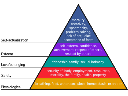
After the developmental psychologist Abraham Maslow published his Hierarchy of Needs in his text A Theory of Human Motivation in 1943 he explained his methodology, preferring to study individuals he saw as exceptional, writing that "the study of crippled, stunted, immature, and unhealthy specimens can yield only a cripple psychology and a cripple philosophy". While this statement has been contentious for over fifty years, what is clear is that a study of unmet needs makes popular fodder for comedy[ref]Even at Maslow's Physiological level - all Sylvester and Wile E. Coyote wanted to do was eat.[/ref].Skills in Time have untold reserves of energy to generate new content - collaborations with other performers like Damien Power will see their unique style continue to develop.
Skills in Time
Got Dem Big City Dreams
Brisbane Powerhouse
March 6-11
Melbourne Comedy Festival
March 28 - April 8
The number of fat lips and corked thighs coming back from the oval indicate that mucking around on the oval is risky fun. No one is playing for sheep stations, but the stakes are possibly high, as an extreme example, if the Year 11 student Jordan Rankin hurt his ankle goofing around on the Palm Beach Currumbin High School oval after his debut game for the Gold Coast Titans in 2008, he would of ended, delayed or seriously endangered a significant career in the NRL. Long hours spent working night shift at McDonalds or lobbying parents have paid for the music kid's Ashtons and Corts, and tickets to music festivals are often more expensive than Korean guitars. By comparison, riffing in the Drama Rooms is very safe, cheap fun - there is a wide disparity between the low stakes and high energy. And make no mistake, the energy is at an incredibly strong level - kids in the drama room talk too loudly, gesture too wildly. They speak at an incredibly rapid rate - like their words are rushing out before their internal censor, possibly their most finely attuned instrument in high school, has time to cut them for fear of embarrassment. They needn't be worried. There is a 'what-happens-in-Vegas' dynamic at play here - their peers in the room aren't likely to be critical of someone doing something strange, as they are experiencing the same giddy euphoria, the contact high transmitted through hammy stage combat.
Skills in Time, the trio of Greg Larsen, Henry Stone and Sam Campbell, stayed in the Drama rooms after the bell rang, and never came out.
[caption id="" align="alignnone" width="566" caption="Skills in Time, Got Dem Big City Dreams"]
[/caption]Got Dem Big City Dreams is a play developed by Skills in Time with the comic Damien Power for Brisbane audiences as a part of both Brisbane Comedy Festival and the Melbourne International Comedy Festival. The guest position of Power is handled well - the trio know that the patter they have developed as a crew has been well earned, and as such Power takes on a multiplicity of supporting characters, not necessarily the straight man but giving a platform for Stone, Campbell and Larsen's characters to play off. Across the characters in their YouTube back catalogue, each of the SiT players draws characterisation from primarily the same locations - Jaydos and Benny Legun are archetypically the same aggressive beta-male, Kevin Brown and Thomas Gentlemen have the same over-earnestness at different levels of confidence. Campbell's characterisations are significantly more fragile. Big City Dreams extends and amplifies these established traits - playing 'themselves', Stone is the loud overcompensator, Larsen the pseudointellectual and Campbell the nice kid in survival mode (think a human Aqua Teen Hunger Force).
The troupe's influences are easy to spot. When Power sustains a note for too long, when Stone licks his bloody lips and stares down the audience, and when Campbell gives repeated delicate kisses to other cast members, long shadows of Messrs Warehiem and Heidecker are cast across the stage. This should in no way suggest that Tim and Eric have freehold title on non-sequiturs, taking advantage of discomfort or just being silly - Wareheim and Heidecker have their own comedy forebears to thank (although it's undeniable that Skills in Time owe the Californian duo a certain debt[ref]As do a number of comics and advertisers - in a recent interview Heidecker notes the multiple examples of commercials that crib their style: http://www.avclub.com/articles/tim-heidecker-and-eric-wareheim,70064/[/ref][ref]It is worth noting the similarities between Skills in Time's focus on father/son relationships and Tim and Eric's Awesome Show! - by the end of the programs five year run Tim and Eric had recruited several actors, including Michael Gross and Patrick Duffy to help analyse mediated fatherhood.[/ref]). What is more interesting to this writer are the moments when Skills in Time move away from stylistically familiar comedy and into uniquely new locations. For this writer the 'Drama room aesthetic' looms the largest - it doesn't get the biggest laughs, of course, but the overarching look and feel of the production gives what could be disparate sketches a consistency and tone this writer hasn't seen before. Tim and Eric used the platform of public access tv to explore ideas about entertainment and creativity, Skills in Time choose the platform of adolescent theatre, of Tournament of Minds and Spacejump, to explore the most uncomfortable sites of growing up and finding applications for a surplus of teenage energy.
For the lions share of the production, Power is dressed in the unofficial after-hours uniform of the boarding student - t-shirt and trackpants. The (multiple) dick jokes are straight out of the Year Nine playbook - one in particular has its origins in the student's pencilcase. The lid of a cheap filing box is a waiter's tray, nikko bleeds through the paper of what is supposed to be a printed flyer. The set pieces could have been nicked from the school library - an overhead projection screen and cheap seat[ref]This writer's high school library had exactly the same make of chair.[/ref] stay on stage for the show's duration. High school drama teachers go to great lengths to lock the props and costume cupboard; This is not because the contents are valuable, they are in fact close to worthless, garnered from thrift stores or donations, their fellow teachers often bring in the toys their kids no longer play with and the uniforms their spouse no longer wears[ref]Police uniforms are especially prized[/ref]. Things 'go missing' from the prop room for a variety of reasons, but one of the strongest is that kids at a stage of identity development can feel the communicative power of objects and clothes - when Henry Stone proudly scabbards a plastic knife in his belt, we can see the a sad lonely kid communicating a vague but empty threat. The worst thing is, it's really funny.[ref]When this writer first read that Chris Lilley was working on a show called Angry Boys, there was a rush of excitement - while Lilley's twins got some successful moments, Got Dem Big City Dreams' focus on the confused actions of boys striving to establish identity is a lot closer to what this was expecting than the product that eventually reached the screen.[/ref]To crudely paraphrase Chekhov, if a two dollar plastic knife appears in the first act, cheap fake blood needs to be used in the following one: joke-store props are better at communicating a thwarted desire to perform than the objects they are trying to signify.
The show, punctuated by short video vignettes[ref]It has to be said that this is really the boys' strongest platform.[/ref], is essentially one act - for the most part the show is a reworking of the well worn City Mouse/Country Mouse trope. Skills in Time reference some of the many productions to make use of Aesop's format, the appropriation of the Perfect Strangers titles is especially clever. When the narrative is close to running it's course the troupe choose to end the show with another popular narrative technique, a talent show. When a sitcom or drama resorts to a talent show episode, it often contributes nothing to the overall development of characters, but allows the show's producers to tap a second (or third, or fourth) talent of their cast. - shining example is the Brady children's performance as "The Silver Platters" in the 1976 season episode 'Amateur Night' of The Brady Bunch[ref]It also serves as a second source of revenue, the song 'It's a Sunshine Day' from the same episode was released as a commercial single.[/ref] Skills in Time use the device to opposite effect - the performances by the shows 'entrants' are exercises in anti-comedy. When the talent show trope happens on-stage in the Drama classroom it signals schism - when a teacher is presented with a in group work as the result of performance brainstorming the implication is the group couldn't come to a consensus for a narrative, the members having strong attachments to disparate characters and action, the talent show a convenient narrative for each member to play out their individual ideas. The teacher's guiding syllabus has strong things to say about collaboration, problem solving and compromise, and subsequently this is often reflected in the group's mark. Unfortunately this dynamic is also at play in Got Dem Big City Dreams - when this writer caught Campbell's Mums vs Dads in a previous performance, it was a show stopper. While it's great that Melbourne audiences will get the chance to see this brief musical moment for the first time, it's easy to think that new 'verses' could have been written for this performance, familiar audiences would appreciate the fresh content, and nothing would be taken away from the overall show.
After the developmental psychologist Abraham Maslow published his Hierarchy of Needs in his text A Theory of Human Motivation in 1943 he explained his methodology, preferring to study individuals he saw as exceptional, writing that "the study of crippled, stunted, immature, and unhealthy specimens can yield only a cripple psychology and a cripple philosophy". While this statement has been contentious for over fifty years, what is clear is that a study of unmet needs makes popular fodder for comedy[ref]Even at Maslow's Physiological level - all Sylvester and Wile E. Coyote wanted to do was eat.[/ref].Skills in Time have untold reserves of energy to generate new content - collaborations with other performers like Damien Power will see their unique style continue to develop.
Skills in Time
Got Dem Big City Dreams
Brisbane Powerhouse
March 6-11
Melbourne Comedy Festival
March 28 - April 8
Sunday, March 4, 2012
Heavy Lifting: Mitch Cairns, 'Piano Removalist' at Boxcopy
[caption id="" align="alignnone" width="500" caption="Mitch Cairns, 'Piano Removalist'"] [/caption]
In the last five years Mitch Cairns has had an especially active role in Sydney's art experience. Between 2009 and 2011 The Cosmic Battle For Your Heart, co-founded by Cairns, staged exhibitions of Australian contemporary artists in their domestic space[ref]The most trivial footnote on this post, if not this site (if not all sites): The Cosmic Battle For Your Heart got the jump on on at least one other collective of young and wildly talented creatives; consider the application of awkward layout, generic clip art and exaggerated use of the font Cooper Black in these two promotional posters (pay special attention to the listed dates):
[caption id="" align="alignnone" width="300" caption="Exhibition Poster, The Cosmic Battle For Your Heart, 2010"] [/caption]
[caption id="" align="alignnone" width="299" caption="Odd Future Poster, 2010"] [/caption]
Note that the artwork for the mixtape Radical is possibly the first public outing of the Cooper Black dominant aesthetic that OF has made instantly recognizable, but that this release was made in May, 2010. Also note that this footnote means absolutely nothing to this writer's response to Cairns' Boxcopy show, and future revisions of this post will probably see it deleted.[/ref] and in 2010 his portrait of performance artist Brian Fuata was selected as a part of the Doug Moran National Portrait Prize.
In this solo show at Brisbane's most geographically central ARI Boxcopy, titled 'Piano Removalist', Cairns profiles recent work in painting, drawing, printmaking and sculpture. The layout of the show in Boxcopy's room is well considered - one corner of the space sees two very different works explore the 'half-way': a canvas advertising a Damp Glass [ref]The glass half-empty/half full question traded for half-wet/half-dry[/ref] for half of a dollar is juxtaposed with a faceless (but most definitely male) figure mid-'limbo'.
[caption id="" align="alignnone" width="449" caption="Mitch Cairns, Cartoon VI, pencil and riso print on paper, 2011"] [/caption]
Another corner of the space seems focused on portraiture. Of these three works, one mixed media, one sculpture and one oil painting on linen, it is Smokey Sad Square that has the most impact for this writer. Mashing up the aesthetics of international packing symbols, AIGA's No Smoking sign and the looseness of jazz album covers, this painting, presumed by this writer to be a self-portrait, is an example of Cairns' output at full volume.
[caption id="" align="alignnone" width="500" caption="Mitch Cairns, Smokey Sad Square, oil on linen, 2011"] [/caption]
The title of the show is dense with associations. The work in the show adopts a loose, almost-finished aesthetic - but of course when moving delicate and complicated instruments it is a given that they arrive slightly out of tune. The title's reference to a role, rather than a practice is also worthy of attention; some people play the piano for a living, others shift them from one location to another. For the painter Cairns to identify himself not with individual creative practice but with the 'grunt work' that supports it[ref]Young artists often find themselves involved in both - Andrew Frost recently made light of this in a piece for the Sydney Morning Herald: http://www.smh.com.au/entertainment/art-and-design/the-a-to-z-of-contemporary-art-20120301-1u40k.html - refer to entries A for Artist and C for Curator in particular.[/ref] is telling, his job might be less about painting, drawing and building, and more about lifting hefty ideas and shifting them from location to location. Especially important to this reading of the title is that this is the kind of work you can't do alone[ref]This writer has shifted a few pianos in the recent past, and can attest it is difficult, perilous and collaborative work[/ref]. So who is helping to lift and shift these weighty loads?
Many hands make light work, and there could well be a good many hands involved in creating the contexts Cairns operates in. In Rachel Fuller's text supporting the show, and in titles of previous paintings by Cairns, Eric Thake is referenced, and the Victorian modernists sly, laconic style is easily apparent in the paintings of 'Piano Removalist'. Cairns name-checks the New Zealand painter Tom Kreisler in one work (ironically this work has arguably the least visible sense of humour in the show) and Australian non-objective painter Shane Haseman in another. Like a lot of young artists in his and previous generations (including Kreisler), has spent much of his practice in the location between high brow and low brow: the overall tone of the show has the looseness of David Shrigley, the dick-joke anthropology of Mike Kelley and the complicated sadness of both. In general, Cairns seem more interested in how jokes can expand to fill visual space rather than exploring a Richard Prince-style line of ambiguous social critique, but nonetheless owes a small debt to Prince for securing a place for people's lewdest expressions in contemporary art. Maybe the strongest set of arms belong to Peter Tyndall, another artist whose application of retro styles belies contemporary practice at its most shrewdly self-aware.
Other touchstones for Cairn's sparse lines and exaggerated features lie outside of visual art's ledger - the long, angular noses and round glasses evoking John Lennon's self portrait used in posters for and opening credits of the Imagine documentary, the absentminded composition and juvenile strategies echo stongly with Vonnegut's supplementary doodles in Breakfast of Champions and other novels.
[caption id="" align="alignnone" width="640" caption="Kurt Vonnegut, page 5 of Breakfast of Champions, 1973"] [/caption]
While no pianos have been lifted up the narrow stairs to Boxcopy, a bongo drum sits on the gallery floor, and crudely hand-drawn and sparse music notation appears above the likeness of the avant-garde French pianist in Tom Kreisler as a jug as Erik Satie. Other musical references can be found in the show, but it's hard to tell if they are intentional. The 2x2 grid of mustachioed, beaded, long haired men of Cartoon XV might be a crude mirror of the cover of Let It Be, the pub struck by lightning in Cartoon XIV[ref]
[caption id="" align="alignnone" width="428" caption="Mitch Cairns, Cartoon XIV, 2011"] [/caption]
[/ref] might make a visual reference to Bad Brains' self titled album of 1982. Or, more importantly, they might not - the viewer is given free licence to create meaning: Mitch Cairns the Piano Removalist doesn't own these Steinways and Broadwoods, he is paid to move these items into our spaces, so after he has left we can be alone and play.
Piano Removalist
New work by Mitch Cairns
Boxcopy
3 – 24 March 2012
[/caption]In the last five years Mitch Cairns has had an especially active role in Sydney's art experience. Between 2009 and 2011 The Cosmic Battle For Your Heart, co-founded by Cairns, staged exhibitions of Australian contemporary artists in their domestic space[ref]The most trivial footnote on this post, if not this site (if not all sites): The Cosmic Battle For Your Heart got the jump on on at least one other collective of young and wildly talented creatives; consider the application of awkward layout, generic clip art and exaggerated use of the font Cooper Black in these two promotional posters (pay special attention to the listed dates):
[caption id="" align="alignnone" width="300" caption="Exhibition Poster, The Cosmic Battle For Your Heart, 2010"]
[/caption][caption id="" align="alignnone" width="299" caption="Odd Future Poster, 2010"]
[/caption]Note that the artwork for the mixtape Radical is possibly the first public outing of the Cooper Black dominant aesthetic that OF has made instantly recognizable, but that this release was made in May, 2010. Also note that this footnote means absolutely nothing to this writer's response to Cairns' Boxcopy show, and future revisions of this post will probably see it deleted.[/ref] and in 2010 his portrait of performance artist Brian Fuata was selected as a part of the Doug Moran National Portrait Prize.
In this solo show at Brisbane's most geographically central ARI Boxcopy, titled 'Piano Removalist', Cairns profiles recent work in painting, drawing, printmaking and sculpture. The layout of the show in Boxcopy's room is well considered - one corner of the space sees two very different works explore the 'half-way': a canvas advertising a Damp Glass [ref]The glass half-empty/half full question traded for half-wet/half-dry[/ref] for half of a dollar is juxtaposed with a faceless (but most definitely male) figure mid-'limbo'.
[caption id="" align="alignnone" width="449" caption="Mitch Cairns, Cartoon VI, pencil and riso print on paper, 2011"]
[/caption]Another corner of the space seems focused on portraiture. Of these three works, one mixed media, one sculpture and one oil painting on linen, it is Smokey Sad Square that has the most impact for this writer. Mashing up the aesthetics of international packing symbols, AIGA's No Smoking sign and the looseness of jazz album covers, this painting, presumed by this writer to be a self-portrait, is an example of Cairns' output at full volume.
[caption id="" align="alignnone" width="500" caption="Mitch Cairns, Smokey Sad Square, oil on linen, 2011"]
[/caption]The title of the show is dense with associations. The work in the show adopts a loose, almost-finished aesthetic - but of course when moving delicate and complicated instruments it is a given that they arrive slightly out of tune. The title's reference to a role, rather than a practice is also worthy of attention; some people play the piano for a living, others shift them from one location to another. For the painter Cairns to identify himself not with individual creative practice but with the 'grunt work' that supports it[ref]Young artists often find themselves involved in both - Andrew Frost recently made light of this in a piece for the Sydney Morning Herald: http://www.smh.com.au/entertainment/art-and-design/the-a-to-z-of-contemporary-art-20120301-1u40k.html - refer to entries A for Artist and C for Curator in particular.[/ref] is telling, his job might be less about painting, drawing and building, and more about lifting hefty ideas and shifting them from location to location. Especially important to this reading of the title is that this is the kind of work you can't do alone[ref]This writer has shifted a few pianos in the recent past, and can attest it is difficult, perilous and collaborative work[/ref]. So who is helping to lift and shift these weighty loads?
Many hands make light work, and there could well be a good many hands involved in creating the contexts Cairns operates in. In Rachel Fuller's text supporting the show, and in titles of previous paintings by Cairns, Eric Thake is referenced, and the Victorian modernists sly, laconic style is easily apparent in the paintings of 'Piano Removalist'. Cairns name-checks the New Zealand painter Tom Kreisler in one work (ironically this work has arguably the least visible sense of humour in the show) and Australian non-objective painter Shane Haseman in another. Like a lot of young artists in his and previous generations (including Kreisler), has spent much of his practice in the location between high brow and low brow: the overall tone of the show has the looseness of David Shrigley, the dick-joke anthropology of Mike Kelley and the complicated sadness of both. In general, Cairns seem more interested in how jokes can expand to fill visual space rather than exploring a Richard Prince-style line of ambiguous social critique, but nonetheless owes a small debt to Prince for securing a place for people's lewdest expressions in contemporary art. Maybe the strongest set of arms belong to Peter Tyndall, another artist whose application of retro styles belies contemporary practice at its most shrewdly self-aware.
Other touchstones for Cairn's sparse lines and exaggerated features lie outside of visual art's ledger - the long, angular noses and round glasses evoking John Lennon's self portrait used in posters for and opening credits of the Imagine documentary, the absentminded composition and juvenile strategies echo stongly with Vonnegut's supplementary doodles in Breakfast of Champions and other novels.
[caption id="" align="alignnone" width="640" caption="Kurt Vonnegut, page 5 of Breakfast of Champions, 1973"]
[/caption]While no pianos have been lifted up the narrow stairs to Boxcopy, a bongo drum sits on the gallery floor, and crudely hand-drawn and sparse music notation appears above the likeness of the avant-garde French pianist in Tom Kreisler as a jug as Erik Satie. Other musical references can be found in the show, but it's hard to tell if they are intentional. The 2x2 grid of mustachioed, beaded, long haired men of Cartoon XV might be a crude mirror of the cover of Let It Be, the pub struck by lightning in Cartoon XIV[ref]
[caption id="" align="alignnone" width="428" caption="Mitch Cairns, Cartoon XIV, 2011"]
[/caption][/ref] might make a visual reference to Bad Brains' self titled album of 1982. Or, more importantly, they might not - the viewer is given free licence to create meaning: Mitch Cairns the Piano Removalist doesn't own these Steinways and Broadwoods, he is paid to move these items into our spaces, so after he has left we can be alone and play.
Piano Removalist
New work by Mitch Cairns
Boxcopy
3 – 24 March 2012
Friday, February 17, 2012
NOW SHOWİNG: Richard Phillips 'Lindsay Lohan' at IMA
[ref]This is presented for consideration into the level of consent given by celebrity in the creation of parody-, pastiche- or reference-based works, values-neutral as they might appear.[/ref]
A hackneyed phrase: to dot your is and cross your ts. The cross is a cross-stroke, the dot is a tittle. In the Latin Alphabet, the capital letter I has no tittle. The Turkish alphabet features dotted and undotted i's, both upper and lowercase. While the distinction between the two characters is important to Turkish pronunciation, the appearance of İ in Richard Phillips' Lindsay Lohan, now screening at IMA, is an entirely aesthetic decision.
The artist's name, the name of his subject and the artist's gallerist all get the dotted-I treatment[ref]It is almost a bizarre instruction that a typical New Zealander's pronunciation of the names is verboten[/ref]. Taylor Steele co-directed the production, but is not credited in the film's 90 seconds (you could facetiously suggest this is because he doesn't have an I in his name to tittle). Steele's background is in surfing films, and the shots of Lohan against an panoramic seascape are very well composed. In other moments the actress stares into the middle distance, meeting and then avoiding the camera's gaze. In these moments the work most closely resembles Phillips' paintings, close-up portraits which he has been exhibiting since the mid-nineties.
")
A shot that has received significant attention in the art press is one in which Lohan considers her own image. Johnathan Jones writes in the Guardian that the actress is
This is an easy reading to come to, especially with this image being in such close proximity to a powerful shot in Peter Weir's The Truman Show (1998) of the reality TV mastermind Christof (Ed Harris) touching the oversized image of his sleeping star.
[caption id="" align="alignnone" width="1280" caption="Peter Weir 'The Truman Show' (1998)"]") [/caption]
[/caption]
However this writer thinks the decision-making surrounding this shot might be closer to self-portrait than social critique - considering the size and facial focus of Phillips' paintings, examining oversized faces in close quarters is the artist's bread and butter. Appearances on SNL (and other comedy platforms, to be discussed later), interviews and commercials notwithstanding, this is the first film Lohan has appeared in as herself - in this shot however, she could well be playing Phillips, or at the very least giving a performance that asks us to consider Phillips' embodied experience of painting[ref]Whether by design, coincidence, or this writers overattentiveness to Phillips' typographic anomaly (or a strange amalgam of the three) the eye sitting above Lohan's almost vertical forearm also takes on the appearance of a dot hanging over an i.[/ref].
[caption id="" align="alignnone" width="490" caption="Richard Phillips working on 'Der Bodensee' (2008)"]") [/caption]
[/caption]
The soundtrack is compelling, but ultimately misleading - shoegaze is a genre that needs an expansive duration to grow and decay, the composition by Tamaryn and Rex John Shelverton feels cramped in the film's 90 seconds[ref]Consider the musicians' unabridged work:
[/ref]. Overall the soundtrack lends the work a complex dynamic. The heavily distorted guitar has an edge of anxiety to it while the tambourine associates the images onscreen with a new-age, psychedelic aesthetic.
The premise of the work is exciting - applying the highly-developed, highly-budgeted techniques of commercial advertising to thin air - but the closing credits complicate the work in unhelpful ways. While graphology is both inapplicable to type and a deeply junk science, it is telling that the letter I when enhanced in scale can mean an overactive ego; when enhanced with embellishments the letter can show immaturity and a desire for attention. After making this film, Phillips went on to work with Sasha Grey in a similarly composed video work. While both actresses are talented and highly photogenic, it would be concerning to this writer if Phillips made a habit of working with women conservative commentators see as needing some kind of 'redemption'. After Rebecca Black was, in some cases viciously, mocked in early 2011, she collaborated with the website Funny or Die in April to lampoon her public image herself (currently the singer Lana Del Ray seems to be caught by a public keen to flex those muscles again, but appears unlikely to have her image be similarly co-opted). Lohan herself worked with Funny or Die in a series of faux dating commercials following her split from Samantha Ronson in 2009. When introducing a news piece on her appearance on the site ABC anchorman Robin Roberts said, "It's not just getting laughs, it may get her career back on track."[ref]Adams, G. (2009, April 20). Lindsay Lohan and the irresistible rise of 'mockumentary'.Retrieved from The Independent: http://www.independent.co.uk/news/media/online/lindsay-lohan-and-the-irresistible-rise-of-mockumentary-1671340.html[/ref] In an eerie echo of this, Linda Yablonsky wrote for the New York Times that "thanks to the painter Richard Phillips, pop culture’s current tragic heroine is making a cogent leap from the tabloids to the art world"[ref]Yablonsky, L. (2011, May 26). Lindsay Lohan, Art Star. Retrieved from T Magazine: http://tmagazine.blogs.nytimes.com/2011/05/26/artifacts-lindsay-lohan-art-star/[/ref](in the same article the film is labelled a "psychological portrait", but it is also noted that the artist and the actress had never met before the shoot).
Ultimately archetypes of jezabel and saviour aren't helpful to a reading of the work, simply to the press and markets that promote it. A serious question in response to Yablonsky's article is who should be "thanking" who?[ref]Especially given Lindsay Lohan is Phillips' first experience making film, claiming that before the production he had not even shot a video with his iPhone[/ref] Both actresses have given Phillips something many of his paintings' subjects have not: consent. While his technique of appropriating press photos and other images in creating work is one respected by this writer, when given this kind of access to a performers name, image and complicity, much more should be achievable than is actually realised by Phillips' current output.
Richard Phillips
Lindsay Lohan
Institute of Modern Art
18 February — 14 April
A hackneyed phrase: to dot your is and cross your ts. The cross is a cross-stroke, the dot is a tittle. In the Latin Alphabet, the capital letter I has no tittle. The Turkish alphabet features dotted and undotted i's, both upper and lowercase. While the distinction between the two characters is important to Turkish pronunciation, the appearance of İ in Richard Phillips' Lindsay Lohan, now screening at IMA, is an entirely aesthetic decision.
The artist's name, the name of his subject and the artist's gallerist all get the dotted-I treatment[ref]It is almost a bizarre instruction that a typical New Zealander's pronunciation of the names is verboten[/ref]. Taylor Steele co-directed the production, but is not credited in the film's 90 seconds (you could facetiously suggest this is because he doesn't have an I in his name to tittle). Steele's background is in surfing films, and the shots of Lohan against an panoramic seascape are very well composed. In other moments the actress stares into the middle distance, meeting and then avoiding the camera's gaze. In these moments the work most closely resembles Phillips' paintings, close-up portraits which he has been exhibiting since the mid-nineties.
A shot that has received significant attention in the art press is one in which Lohan considers her own image. Johnathan Jones writes in the Guardian that the actress is
contemplating her own outsized image. The image is bigger than she is: the real Lindsay Lohan is dwarfed by the colossus of her fame – but this art film is not rejecting the myths of celebrity, it is fascinated and enraptured by those myths.[ref]Jones, J. (2011, May 30). A love letter to Lindsay Lohan - and the moving image. Retrieved from The Guardian: http://www.guardian.co.uk/artanddesign/jonathanjonesblog/2011/may/30/richard-phillips-lindsay-lohan[/ref]
This is an easy reading to come to, especially with this image being in such close proximity to a powerful shot in Peter Weir's The Truman Show (1998) of the reality TV mastermind Christof (Ed Harris) touching the oversized image of his sleeping star.
[caption id="" align="alignnone" width="1280" caption="Peter Weir 'The Truman Show' (1998)"]
[/caption]However this writer thinks the decision-making surrounding this shot might be closer to self-portrait than social critique - considering the size and facial focus of Phillips' paintings, examining oversized faces in close quarters is the artist's bread and butter. Appearances on SNL (and other comedy platforms, to be discussed later), interviews and commercials notwithstanding, this is the first film Lohan has appeared in as herself - in this shot however, she could well be playing Phillips, or at the very least giving a performance that asks us to consider Phillips' embodied experience of painting[ref]Whether by design, coincidence, or this writers overattentiveness to Phillips' typographic anomaly (or a strange amalgam of the three) the eye sitting above Lohan's almost vertical forearm also takes on the appearance of a dot hanging over an i.[/ref].
[caption id="" align="alignnone" width="490" caption="Richard Phillips working on 'Der Bodensee' (2008)"]
[/caption]The soundtrack is compelling, but ultimately misleading - shoegaze is a genre that needs an expansive duration to grow and decay, the composition by Tamaryn and Rex John Shelverton feels cramped in the film's 90 seconds[ref]Consider the musicians' unabridged work:
[/ref]. Overall the soundtrack lends the work a complex dynamic. The heavily distorted guitar has an edge of anxiety to it while the tambourine associates the images onscreen with a new-age, psychedelic aesthetic.
The premise of the work is exciting - applying the highly-developed, highly-budgeted techniques of commercial advertising to thin air - but the closing credits complicate the work in unhelpful ways. While graphology is both inapplicable to type and a deeply junk science, it is telling that the letter I when enhanced in scale can mean an overactive ego; when enhanced with embellishments the letter can show immaturity and a desire for attention. After making this film, Phillips went on to work with Sasha Grey in a similarly composed video work. While both actresses are talented and highly photogenic, it would be concerning to this writer if Phillips made a habit of working with women conservative commentators see as needing some kind of 'redemption'. After Rebecca Black was, in some cases viciously, mocked in early 2011, she collaborated with the website Funny or Die in April to lampoon her public image herself (currently the singer Lana Del Ray seems to be caught by a public keen to flex those muscles again, but appears unlikely to have her image be similarly co-opted). Lohan herself worked with Funny or Die in a series of faux dating commercials following her split from Samantha Ronson in 2009. When introducing a news piece on her appearance on the site ABC anchorman Robin Roberts said, "It's not just getting laughs, it may get her career back on track."[ref]Adams, G. (2009, April 20). Lindsay Lohan and the irresistible rise of 'mockumentary'.Retrieved from The Independent: http://www.independent.co.uk/news/media/online/lindsay-lohan-and-the-irresistible-rise-of-mockumentary-1671340.html[/ref] In an eerie echo of this, Linda Yablonsky wrote for the New York Times that "thanks to the painter Richard Phillips, pop culture’s current tragic heroine is making a cogent leap from the tabloids to the art world"[ref]Yablonsky, L. (2011, May 26). Lindsay Lohan, Art Star. Retrieved from T Magazine: http://tmagazine.blogs.nytimes.com/2011/05/26/artifacts-lindsay-lohan-art-star/[/ref](in the same article the film is labelled a "psychological portrait", but it is also noted that the artist and the actress had never met before the shoot).
Ultimately archetypes of jezabel and saviour aren't helpful to a reading of the work, simply to the press and markets that promote it. A serious question in response to Yablonsky's article is who should be "thanking" who?[ref]Especially given Lindsay Lohan is Phillips' first experience making film, claiming that before the production he had not even shot a video with his iPhone[/ref] Both actresses have given Phillips something many of his paintings' subjects have not: consent. While his technique of appropriating press photos and other images in creating work is one respected by this writer, when given this kind of access to a performers name, image and complicity, much more should be achievable than is actually realised by Phillips' current output.
Richard Phillips
Lindsay Lohan
Institute of Modern Art
18 February — 14 April
The Rookie Device: 'Test Pattern: New Art by New Queensland Artists' at Ryan Renshaw
When a movie or tv show screenwriter wants to speed up exposition, particularly when introducing characters at the start of a series, a well-worn device is the introduction of 'the rookie'. In reality, a group of people in an already established team have no reason to spend time with each other re-introducing themselves and describing their background - by introducing a character new to the environment, the audience get a rollerskate tour of the major players and their origin stories. Popular in sci-fi, school-based dramadies, heist films and police procedurals the device is not always strong writing, but is not always weak; compare Scrubs to Toy Story, or The Devil Wears Prada to Platoon (the device is also not by any means necessary[ref]A really great example of unhampered environmental exposition is The Wire. Whatever David Simon's hypothesis turned out to be, it was clear that his laboratory and materials were institutions, and people. While in later seasons the show would introduce characters and situations very close to the rookie trope, Simon deftly handled McNulty's gargantuan reputation with dialogue, and Kima's "then he dropped the bracelets" anectode is a simple-yet effective twenty seconds.[/ref] nor does it rely exclusively rely on age or hierarchal position[ref][/ref]).
The device's popularity can be attributed to its effectiveness; as an audience we want the bigger picture, but we don't have all day. So when a survey exhibition of recent graduates of Queensland's art schools is billed as "New Art by New Queensland Artists", the two uses of the word 'new' have different applications - this is fresh work to both artist and audience, and the artists are "shinies" (Star Wars), "nuggets" (Battlestar Galactica), "fresh meat for the grinder" (Starship Troopers). As an audience we get to experience this kind of show on this and many more levels - the art should, always, be experienced at face value, but we also get to step outside our own place in the art network and, like a Hollywood audience, be comfortably introduced to the environment as if for the first time, learning the same lessons as the rookie as they are inducted.
Like the fresh-faced rookies of screen narrative, these artists are identifiably eager to present themselves in the very best light, and as a show the works are individually strong and high-impact as a whole. Perhaps due to the intensity of research required by their study programs some of these artists wear their influences on their sleeve. If Lucian Freud's legacy is evident in the reclining life studies of Dana Laurie, his grandad's is positively unavoidable in the photographs of Yavuz Erkan. Tightly composed and neatly presented, the series Unorthodox Aphorisms presents surreal interactions with domestic objects, the volume is turned all the way up on the psychosexual allusions already apparent in gloves, milk, vessels and balloons. Sex and gender are placed in uncertain locations with simple blocking - in one the male subject uncannily evokes Vermeer's Girl with a Pearl Earring with the simple application of a bath towel. Erkan's palette contributes equally to the calm seduction of the series and its uncomfortably sexual reading, the fleshy pink and tan tones punctuated with a sole inclusion of a striking orange.
[caption id="" align="alignnone" width="600" caption="Yavuz Erkan 'Towel' 2011"]
 [/caption]
The audience member's body is implicated in the works of Hannah Piper and Caitlin Franzmann, the former creating a post-pop installation which also serves as a framing device for the lion's share of the show. The latter depends on the viewers body for the work to be complete, the audience member becoming part of a screen-based tableau vivant. The sculptural blocking in Franzmann's work seems like an extension of her work outside the gallery, particularly her music video for McKisco's Silence Slowly[ref][/ref]. In both cases the artists consider the role of embodiment in the experience of art after Warhol et al (CAVEAT: on this writer's first viewing of the show neither work was installed to completion, a return visit will see this post revised).
In 2008 in the United States the financial services firm Lehmann Brothers collapsed, Frannie Mae and Freddie Mac were subject to a federal takeover and Bear Stearns was acquired by JPMorgan Chase in a fire sale. In concert these events would effectively trigger the tipping point of the GFC. Meanwhile, Vampire Weekend seemed to give the holiday aesthetic of the well-educated, well-heeled class responsible for brokering these deals and the problems that pre-empted them a high dose of cool, with popped collars, cardigans and boat shoes featuring in promotional shots and music videos and Louie Vuitton lyrical name-checks. Jared Worthington contributes objects from The Waverly Collection with prints from the series Chuck Greenleaf to Test Pattern, all brightly coloured and slightly caricaturistic[ref]Somewhere between a Wes Anderson good-guy and an early Adam Sandler bad-guy[/ref]. Like Michael Haneke's charismatic/sadistic Peter and Paul in Funny Games (1997, remade 2008) Worthington's simulated narrative interrogates the audience's complicity in the mass appeal of the accoutrements of the 'one percent'.
[caption id="" align="alignnone" width="500" caption="Jared Worthington - Scarf (2011)"]
") [/caption]
[/caption][caption id="" align="alignnone" width="733" caption="Dord Burroughs - Summer Fruits"]
 [/caption]
Dord Burrough's works fit neatly into an emerging trend in the output of some young Brisbane artists that seems to blend 'two great tastes that taste great together' - slapstick and threat. That is not to say that Burrough doesn't have her own strong voice: the series of paintings contributed to Test Pattern are relentlessly individual in style and are for this writer a source of real excitement in an already compelling show.
If the rookie device is at play in the audiences reading of this exhibition, it is a mainly positive relationship: the artists want to be considered in the context of wider traditions and audiences want to have their understanding of those traditions stretched. As these six recruits join the ranks of the already active field agents of painting, drawing, sculpture and photography the viewer is present at the first briefing. But it should not be forgotten that the stakes are high - while the rookie narrative often charts the ascendancy of the freshman to hero, sometimes the screen is not so kind. Holly Gribbs, played ably by Chandra West, was introduced in the pilot episode of the immensley successful CSI: Crime Scene Investigation in October of 2000. The character fulfilled all of the rookie device's duties, exposing the audience quickly to a the complex array of characters, professional contexts and emotional and moral themes the show would rely on for at least the next twelve years. The audience connected with the 'CSI Level 1' inductee's uneasy charm and her uncertainty which prompted this attempt at inspiration:
Gribbs, and by extension West, proved to be a disposable lever, applied then summarily discarded - less than twenty screen minutes after this rallying pep talk, the character would be dead, shot by the suspect returning to the scene of the crime. Having fulfilled the duties of the rookie device in the first episode, neither Gribbs or West would continue to be a part of the most watched drama in the world. This writer is glad that the artists in this show will have a good deal more agency in their future visibility.
TEST PATTERN 2012
New Art by New Queensland Artists
Ryan Renshaw
FEBRUARY 17 - MARCH 3, 2012
Sunday, February 5, 2012
The Moody Blues, Strange Times: Rebecca Baumann's Automated Monochrome at IMA@Ksubi
Rebecca Baumann: Automated Monochrome
5 February - 18 March, IMA@Ksubi
The Pomodoro Technique, developed in the late 1980's by Francesco Cirillo, is a productivity method based on time management. As friends of this writer will attest it has been a topic of impassioned discussion at certain dinner parties[ref]Admittedly this is not the only productivity technique known to have invoked cult- or pyramid scheme-like fanaticism in its users, this writer included[/ref] as the Technique has seen a marked increase in this writer's output [ref]And being part of this very posts writing[/ref]. Named for the Italian word for tomato, or more specifically the kitschy plastic kitchen timers design in the tomato's image, the Technique is basically a commitment to working in uninterrupted blocks of twenty-five minutes.
 Pomodoro Kitchen Timer, Wikipedia Commons, 2008
In the extensive manual produced to support the concept Cirillo promotes a lofi approach - the equipment suggested for it use is a mechanical timer, a pencil and a piece of paper. Despite this, some, if not most of the Techniques users (including this writer) employ software installed on their computers or mobile phones. Despite the introduction of the digital, these apps are almost exclusively what J. David Bolter would call 'remediations', each featuring satisfyingly mechanical sound effects of ticking and ringing. These digital simulations of hidden gears and bells are worth attention - what is the appeal of the sounds of analogue clocks, watches and timers?
The Perth-based artist Rebecca Baumann has installed Automated Monochrome(2011), a large installation of 96 modified flip-clocks in IMA's satellite space in Ksubi Store in Fortitude Valley. Distinct from her work Automated Colour Field(also 2011), which features bright colours from across the spectrum, this work sees the devices flip through paper in rich tones of blue, and was created for last year’s Primavera exhibition.
 Rebecca Baumann, Automated Monochrome, 2011
The aforementioned manual for the Pomodoro Technique is considered, accessible and idiosyncratic, meshing technical instruction, philosophical inquiry and personal anecdotes. Cirillo's project is founded in an understanding of time as the passing of events, and the less concrete idea of becoming. He sees the former as a cause of much discomfort:
Of these two aspects, it is becoming that generates anxiety – it is, by nature, elusive, indefinite, infinite: time passes, slips away, moves toward the future. If we try to measure ourselves against the passage of time, we feel inadequate, oppressed, enslaved, defeated, more and more with every second that goes by.[ref]Cirillo, Francesco. "The Pomodoro Technique" 2006: http://www.pomodorotechnique.com/resources/ThePomodoroTechnique_v1-3.pdf[/ref]
If Cirillo's Pomodoro Technique is a method to combat these feelings, Baumann's work is most certainly its equal. While the Pomodoro Technique is designed to promote practical and attentive effort,Automated Monochrome is instinctively calming. It contributes a more casually relaxed line of inquiry to Baumann's compelling and often celebration-based body of work. The artist spent her time in residency in 2010 in Berlin focusing on the relationships between colour and emotion. The work's genesis in the home of the immense Weltzeituhr at Alexanderplatz and Dieter Binninger's unique Berlin Clock may not be a coincidence.
The plastic kitchen timer, as an object, has strange properties - a mechanical object in a natural, organic guise. Automated Monochrome is analogous: it is likely some viewers will read it as a landscape, specifically the constantly shifting blue tones of the ocean.
While unlikely to be the artist's intention, there is an interesting element to staging a work, in which the passing of time is marked by changing colours, above a fashion retail outlet. Socially-conscious critics and economically-conscious supporters have noted the fashion industry's uncanny skill in employing 'planned obsolescence' in its market model - while fashion writers announce a 'new black' for each season, Automated Monochrome announces an untold number of 'new blues' with each mechanical flip[ref]The work is also a sizable backdrop for the well-dressed and easily-photographed - Facebook users might recognise it following this afternoon's opening in the background of profile pictures of Brisbane attendees.[/ref].
Simultaneously painting, kinetic sculpture and sound event, Baumann's work at IMA@Ksubi is equally charming and exciting. Opening with an artist talk on the 5th of February, the exhibit continues until the 18th of March.
Sunday, January 8, 2012
This is Why We Can’t Have Nice Things: Nicholas Folland's Domestic Distractions
Nicholas Folland is based in South Australia, and has been recently announced as participating in the 2012 Adelaide Biennial of Australian Art. Sourcing chandeliers, crystal ware and antiques from garage sales, op shops and online auctions Folland stages complicated arrangements of found items, and in his exhibition Domestic Distractions employs light and movement to strong effect.
[caption id="" align="alignnone" width="565" caption="Nicholas Folland: Tools (2010)"]") [/caption]
[/caption]
Folland’s attention to detail is worthy of attention, the brass hanging system of Tools giving what could be an intimidating installation a clinical, passive appearance, like a coleopterist’s drawer. The knives themselves are remarkably unique, some malformed by repeated sharpening. The names crudely engraved into the handles are sobriquets, including ‘Baz’ and ‘Andy’. This both softens the threatening nature of the knives by lending them an informal personality and serves as a conceptual twist – the owner’s proper names have been ‘cut’ – David becomes Dave, Deborah has become Debby.
There are interesting contradictions that link works in the show. In the work Goodnight Sweetheart the artist renders half of symmetrical crystal structures unable to carry out their luxurious light-reflection by wrapping them in cinefoil. In Untitled (Home Renovation) a doily sits on the table as if to protect its surface from the crystal ware, which hovers millimetres above. The tables is elsewhere irreparably cut, two circular holes have been sawn through which the remaining two crystal elements hang. Doilies reappear in Stuart Crystal Decanter and Two Matching Glasses, and Large Stuart Crystal Comport and Two Dessert Bowls, again seemingly protecting the surface of two unlikely tables, shelves supported by finely lacquered branches found in the artist’s neighbourhood. On the doilies sit the recombined materials of the works’ titles, melted down and recast into elemental, almost cartoonish representations of natural crystal. Folland reveals the fallacy behind crystal ware – while having the appearance of cut glass, crystal ware is made by setting melted liquid stone in moulds with deep grooves. Folland’s moulds lack the deep patterns that allow the illusion of cut glass, and his process mars the clarity of the material. In fact the reflections of light on the gallery wall behind the work are of the shelves’ lacquered veneer, the recast items' matt surface absorbing the light.
While the tableware in the Stuart works has been recast literally, the tableware throughout the exhibition has been re-cast figuratively. The collections of crystal ware, once symbols of economic strength and domestic refinement in good homes, have presumably been donated to thrift stores by their original owners, deeming them too good to throw away, but not valuable enough to keep. Although perhaps an over-popular source of exhibition material, particularly in Australia’s art schools, op shop ephemera occupies an actually quite complicated economic site, one which Folland encourages us to consider.
Untitled from Ryan Renshaw on Vimeo.
Twelve years ago M.A. Greenstien described Folland’s objects as ‘bratty’, and his style ‘hip’, in her essay for the 1999 Samstag catalogue. Those descriptions have no real relationship to the work in Domestic Distractions, which is characterised by a considered, even sombre tone.
DOMESTIC DISTRACTIONS
Nicholas Folland
Ryan Renshaw, Brisbane
November 16 – December 10, 2011
[caption id="" align="alignnone" width="565" caption="Nicholas Folland: Tools (2010)"]
[/caption]Folland’s attention to detail is worthy of attention, the brass hanging system of Tools giving what could be an intimidating installation a clinical, passive appearance, like a coleopterist’s drawer. The knives themselves are remarkably unique, some malformed by repeated sharpening. The names crudely engraved into the handles are sobriquets, including ‘Baz’ and ‘Andy’. This both softens the threatening nature of the knives by lending them an informal personality and serves as a conceptual twist – the owner’s proper names have been ‘cut’ – David becomes Dave, Deborah has become Debby.
There are interesting contradictions that link works in the show. In the work Goodnight Sweetheart the artist renders half of symmetrical crystal structures unable to carry out their luxurious light-reflection by wrapping them in cinefoil. In Untitled (Home Renovation) a doily sits on the table as if to protect its surface from the crystal ware, which hovers millimetres above. The tables is elsewhere irreparably cut, two circular holes have been sawn through which the remaining two crystal elements hang. Doilies reappear in Stuart Crystal Decanter and Two Matching Glasses, and Large Stuart Crystal Comport and Two Dessert Bowls, again seemingly protecting the surface of two unlikely tables, shelves supported by finely lacquered branches found in the artist’s neighbourhood. On the doilies sit the recombined materials of the works’ titles, melted down and recast into elemental, almost cartoonish representations of natural crystal. Folland reveals the fallacy behind crystal ware – while having the appearance of cut glass, crystal ware is made by setting melted liquid stone in moulds with deep grooves. Folland’s moulds lack the deep patterns that allow the illusion of cut glass, and his process mars the clarity of the material. In fact the reflections of light on the gallery wall behind the work are of the shelves’ lacquered veneer, the recast items' matt surface absorbing the light.
While the tableware in the Stuart works has been recast literally, the tableware throughout the exhibition has been re-cast figuratively. The collections of crystal ware, once symbols of economic strength and domestic refinement in good homes, have presumably been donated to thrift stores by their original owners, deeming them too good to throw away, but not valuable enough to keep. Although perhaps an over-popular source of exhibition material, particularly in Australia’s art schools, op shop ephemera occupies an actually quite complicated economic site, one which Folland encourages us to consider.
Untitled from Ryan Renshaw on Vimeo.
Twelve years ago M.A. Greenstien described Folland’s objects as ‘bratty’, and his style ‘hip’, in her essay for the 1999 Samstag catalogue. Those descriptions have no real relationship to the work in Domestic Distractions, which is characterised by a considered, even sombre tone.
DOMESTIC DISTRACTIONS
Nicholas Folland
Ryan Renshaw, Brisbane
November 16 – December 10, 2011
Subscribe to:
Posts (Atom)